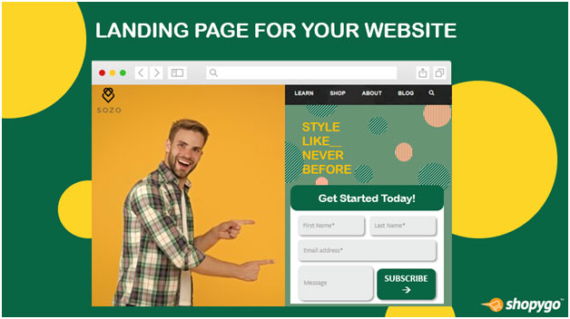
You may be wondering why you need a landing page and why it is so important to establish separate, independent pages to which visitors will be sent when they click on calls to action on your website. After all, creating landing pages takes time.
You may think you'll be able to get away by not using them. However, the landing page is an essential component of lead generation marketing.
A landing page is a separate web page designed expressly for marketing or advertising campaigns in digital marketing. It's the place where a visitor "lands" after clicking on a link in an email or ads from Google, Bing, YouTube, Facebook, Instagram, Twitter, or other websites.
Unlike web pages, which usually have multiple aims and promote research, landing pages have a single emphasis or goal, referred to as a call to action.
Landing Page vs Website Homepage
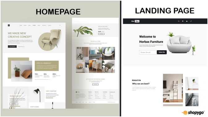
To begin with, some may wonder why they should worry about landing pages when their primary goal is to bring traffic to their homepage. While increasing traffic to your home page is obviously beneficial, it is less likely to result in a conversion than traffic to a landing page.
Users are invited to navigate to a range of different locations from home pages, which offer a lot of information. If a visitor comes to your homepage with a certain objective in mind, they may be turned off if they first have to navigate through a multitude of services and product possibilities.
The primary goal of the homepage is to direct visitors to other pages where they can get the information they want. Landing pages avoid the intermediate step by being the page that the user wants and communicating it effectively.
A landing page is focused and specific, whereas your homepage is generic. A landing page, on the other hand, gives one simple and clear call to action, whereas the homepage leads users further into your website by showing all of the options your business has to offer.
Landing pages are the perfect option for raising the sales volume of your marketing campaigns and minimizing the cost of gaining a lead or sale because of this focus.
Marketing Funnel
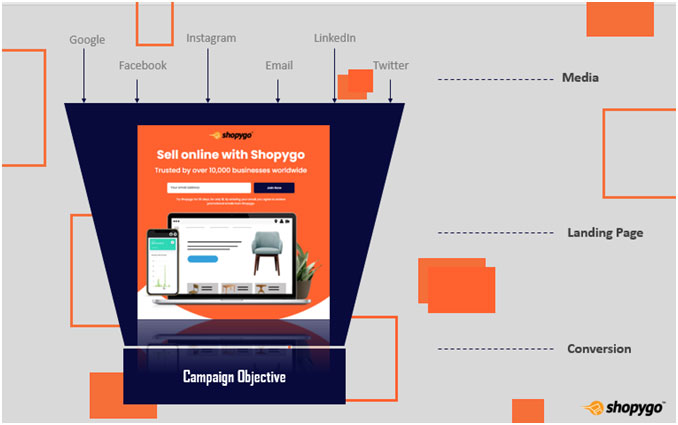
A marketing funnel is a system for attracting and converting potential consumers to your business. Here's how landing pages can help you with your marketing funnel:
As you can see, the landing page is designed when prospects at the top of the funnel click a link in an advertisement, an email, or anywhere else on the internet. It is here that the conversion (such as a purchase, signup, or registration) will occur.
The Conversion Mechanism
Although the landing page is the most important part of the conversion process, there are other elements that work together to ensure a successful conversion. If you want to be successful with your lead generation efforts, your landing pages should always feature the following elements:
1. Landing Page Design
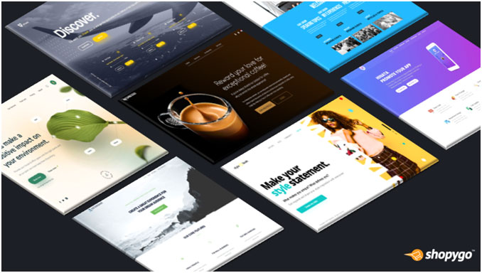
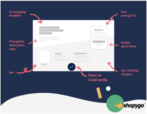
When a potential lead visits your page, you just have a few seconds to reach out to them before they leave. The content and design decisions on landing pages perform the hard lifting to hook visitors and keep them moving quickly towards the conversion event, which is often a submission form. They should be able to recognize key concepts straight away and be compelled to learn more, register, or download right away.
It's never been a better moment to make professional design decisions than now. Maintain consistency in the landing page's design with the remainder of your brand. Also, remember the golden rule of design: there should be enough of white space.
Allow space for your content, photos, videos, and CTA buttons to breathe against a distraction-free background. Make sure your content is searchable and that your titles stand out. Graphics, bullet points, and calls to action can be used to break up lengthy paragraphs.
A generic page that looks like all of your other pages won't be able to provide unique material, whereas a customized template created just for this type of content will give you a much better chance of attracting new leads.
2. Lead Capture Forms
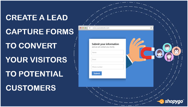
For landing pages, forms are required. Your landing page's ultimate goal is to attract visitors to fill out a form. This is how you'll get someone to convert from browsing to subscribing. You are essentially wasting your time and resources without the information that visitors share. That isn't to say that your forms need to be excessively complicated.
The name and email address are the most important pieces of information you want from your first landing page visitors. This will help you to move your prospects to the next stage of your sales funnel. Obviously, you want that process to be as smooth as possible.
To begin, select an online form builder that is appropriate for your website. Then look for methods to make the process easier for your users. Only ask for the information you really need on your lead capture forms to make them as quick and easy to fill out as possible. For example, the customer's name, email address, and potentially their phone number.
3. Effective Headline
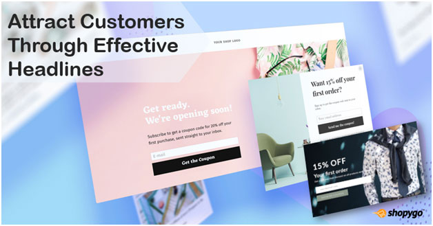
The headline of the landing page is the first thing visitors will see. As a result, it's critical that it explains exactly what a user will get from the page. The message should be engaging enough to attract the visitor's interest and keep them on your page. Understanding, attention, and interest should all be promoted by your headline. It needs to accomplish:
- Capturing the attention of the visitor
- Explaining what your product or service is all about to the visitor
- It should be brief.
4. Call-to-action (CTA)
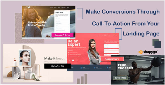
A clear call-to-action button that demands attention is required on your landing page. Use a contrasting colour (which doesn't have to be a bright hue) and an actual button to boost effectiveness, as consumers have been educated to expect one. Make the button large enough to see where to redeem your offer, and keep the page free of clutter and distractions. When selecting where to place the button, you can consider the F-Pattern and Z-Pattern of eye movement. To avoid confusing your visitors, make sure to use only one CTA per landing page.
5. Indicators Of Trust
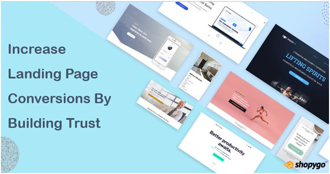
Try to integrate statistical information, testimonials and reviews, or trust badges, such as medals or customer logos, to boost the credibility of your business. People are 71 percent more likely to make a purchase if they are referred by social media, therefore social proof can help boost conversions.
On the page, you can indicate the numberof readings, shares, likes, or subscriptions, and you should also add social media sharing icons so that visitors can spread the word about your offer.
Another strategy to boost credibility is to include your company's phone number and address on the landing page. This shows visitors that you're a legal business, which is especially important given how limited the design and navigation of a smart landing page will be.
6. Use Images And Videos
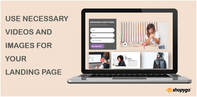
This is a visual representation of your offer that assists visitors in better understanding what your offer is and how it appears. Showing rather than telling the context of use has the most effect. Encourage your visitors to put themselves in a situation and imagine how they might use it. You can use photos or videos to do this. If you include images, make sure they're big, high-quality, and related to your business or product. It is crucial to have an image of the product on your landing page, especially if you are selling a real product. When advertising service, the image should demonstrate its utility and attract visitors' attention.
7. Page Of Appreciation
Although most tools have an in-line thank you message, it is recommended that you provide your new lead with a dedicated thank you website. New leads can use the "download now" button on thank you pages to acquire the download you offered on the landing page. Thank you, pages are a wonderful approach to, extend the conversion process and advance the lead along the marketing funnel in addition to hosting the offer. Secondary offers (case studies, consultations, webinars, and more) should be displayed on the thank you page via a different form or special CTAs to direct the lead to the next step.
A Link Between Ads And Your Product
Landing pages serve as a link between the advertisement and the product. This means that the advertisement that the user first clicked on doesn't adequately convey the brand's personality or move the customer around the website.
A landing page can carry, introduce, and guide the user along the customer journey of a brand. Signing up for a newsletter, purchasing a service or product, and other conversion activities are examples of the end destination. It's critical that the content on your landing page matches that of the advertising or promotional images you're using. This assures that consumers
This assures that consumers know they are in the appropriate place, and that the message is consistent, which is especially important when advertising to a cold audience.
Promotional Methods For Your Landing Page
Once the landing page is finished, your work isn't done. It has just begun. What was the point of designing your landing page if no one saw it? The following are some of the best ways to promote your landing page.
CTAs: As previously said, CTAs are an excellent approach to promote the content on a landing page. Remember that the CTA should be in sync with the material it's on as well as the landing page. People are more likely to convert if these resources are well-coordinated. Place CTAs on popular site pages that are relevant to the offer, as well as in blog posts that support the offer.
Email: Email is a great way to let people know about your landing page. Send a promotional email to a specific list rather than the entire email database. The more specific the list is in regards to your landing page, the more likely visitors are to convert. You don't have to start over from scratch with this; a lot of the content from the landing page can be converted into emails.
Social Media: As you're certainly aware, social media is a useful platform for reaching out about your business. However, a word of caution: Don't promote on every platform simply because you think it's what you're meant to do. Choose a few channels where you know your profiles are active and heavily advertise them. Consider whether your customers are frequent Facebook users before promoting on a Facebook page just because everyone else is. If that isn't the case, you should probably search elsewhere.
You've got this!
Despite these standards, each business and customer are unique. Most importantly, make sure you're always testing and evaluating the outcomes to learn how to enhance your landing pages.
Now get to work on your landing pages and convert those visitors into potential customers of yours.


